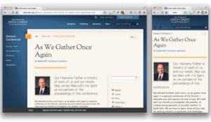
 I just got back from the Breaking Development conference in Dallas. A phenomenal conference on mobile goodness. You should go.
One of the presentations was by Karen McGrane titled Uncle Sam Wants You (To Optimize Your Content for Mobile) in which she, in part, goes into how President Obama has mandated that federal agencies should optimize for mobile web content.  Each agency had something like 90 days to get two main feature on mobile… or something along those lines. The crazy thing was, they were starting to deliver.
A bit of history
I don’t know that I have really mentioned that I work for The Church of Jesus Christ of Latter-day Saints on here previously. Â I’m the front-end development lead for LDS.org. Â We have naturally wanted to support mobile for a LONG time, but we have a huge site that is sometimes difficult to get to change direction. Â The decision makers are on board with responsive web design, but sometimes getting new content and sections out is more important than improvements, and rightly so. Â We do strive to make anything new responsive though.
We have a LOT of content. The site is the web presence for 4 magazines with 40+ years of monthly content, curriculum for various age levels, scriptures and the text, audio and video of the semi-annual General Conference of the entire church membership (over 14 million). Yes… a LOT of content.
Most of that content is simple article pages. Â Just text and the occasional image. Â Prime pickings for responsive. Â But we have lots of other pages that are more complicated with carousels, features, etc. Stuff that is definitely responsiveizable (yes I made that word up), but not as easily as the articles.
…and we’re back
Back to the Government. After hearing about their mandate, and success, I reflected back to project from the beginning of 2012 where I needed to make some existing content (our global header and footer) work on a new site that was going to be responsive. The header/footer is used on various sites, controlled by different teams. It wasn’t something I could go in and just change up on a whim. Â So I started playing around in Google Chrome’s debug tools to see what I could do by only changing the CSS. Â I was surprised by how far I was able to get.
I then started working on a separate responsive.css file that could be dropped into any site that wanted to be responsive. Â It wasn’t perfect, but provided a way for us to support responsive and non-responsive at the same time. We have since released a completely new header/footer that is responsive from the ground up.
I also attended an online conference called Responsive Web Design Summit back in August. One of the talks was called Retroffiting Sites for Responsive Web Design by Ben Callahan, where he described doing much the same process that I did for our old header/footer. It was nice to have a good name for that type of process.
During Karen’s talk, I started to lament how the government could get to mobile before I could. I started to ponder what I could do with a retrofit of LDS.org, instead of waiting for a new design. It worked before, why not again?
The retrofit begins
That night (ok maybe during that talk… and the next one…) I started playing around in my inspector. I made progress quickly, so I jumped to the CSS files themselves.
I came back to work and pitched the idea to the project project manager. Â My pitch was that this would be a true retrofit. This would be CSS and JS changes only, no code changes. He was very enthusiastic and gave me the go ahead to dive in fully.
I made progress quickly. We consciously did NOT try to tackle the homepage or section landing pages that had large image carousels and other fanciness.  We wanted to target the content specific pages.  First I got them working pretty well, then I got to wondering if I could get our index (table of contents) pages working. These also came together pretty well.  As the day went on more and more of the site was starting to be responsive, and it was actually looking good.  Not as kludged together as I had feared it might look.
Now being that this is a retrofit with no code changes, things are definitely kludgey (they apparently just don’t look that way). I have to use JS to look for certain classes or ID’s on the pages that I want to target, and if found add an additional class to the page to trigger all the responsive goodness to fire. Â This means you may see the desktop version for a quick second before it changes to the responsive version. We all know this isn’t great, but it is better than nothing.
How fast can I get this out?
This weekend (tomorrow) is our General Conference. Â Wednesday, during a one on one with my manager, I asked what the possibility of us launching this retrofit (that I had started like 2 days prior) to the live site *before* General Conference would be. Â My thinking is that General Conference is a huge event. Every year it gets more and more popular in social media. Â #ldsconf regularly trends on Twitter during the conference sessions. This means lots of people on mobile devices talking about and going to the General Conference pages. Â How cool would it be if when they went there, it was a good experience.
He looked at me in shock, and I admitted it was a long shot, but figured I would ask. Â He said he would talk to those in charge of the site and let me know.
The next day he came back, I looked at him with anxious eyes and he gave me a thumbs up. Â My jaw hit the floor and I got this huge grin on my face at the same time (is that what happend to the joker?). I couldn’t believe it was going to go from idea to implementation to release in under a week. Â Suddenly the butterflies were flapping like crazy in my stomach. I had lots of polishing to do.
I got to it. I got some input from a designer, our QA team started working on it as well. Things started looking better and better. We found more and more pages that we could add to the list. Â Thursday we got the full green light and I pushed it out about an hour ago (3pm MST).
It lives!!!
Wow. What a whirlwind. I am so amazingly stoked to get this retrofit out to the world. Is it perfect? Oh no… far from it. Â Does it work on every mobile device out there? Nope. Is it a HUGE improvement for the majority of mobile users visitor our site? Yup. I couldn’t be happier to have gotten so much done in such little time. I love the trust that other put in me to make this happen. Â There is no way I am going to let us rest in this current state. If anything, this makes me want to push harder for a better experience across the board.
We have 10’s of thousands if not 100’s of thousands of pages of content. We just got 80-90% of them responsive for the majority of smartphones in less than a week. Â This may not be a microsoft.com or disney.com level of responsive release (which also happened this week). But I’m pretty proud of what we accomplished. Â Hopefully we can retrofit our homepage and section landing pages soon. It would be great to be responsive end to end, but some of those changes will require more efforts than CSS and JS alone can provide.
Responsive design can be done, even on a ginormous site. It’s just a step along the path to a better site for the users who come to consume our content.
Update:
A few more details based on questions I have received in person or elsewhere.
Why the need to have “no code changes” (html)?
For a period of time before and after our General Conference we go into a limited release period to make sure we don’t do anything that will cause problems with the site during this critical time of getting content out via various methods (live streams, downloads, etc). We have moved our CSS and JS to a separate CDN server and so updating there had very little risk of causing a problem, as opposed to trying to stick in a new class on the HTML but missing a semi-colon (or something) making the page break. Had this not been done, there would have been zero chance of this going out.
We have full intention of going in and hardcoding the needed additional classes once the limited release period is over, as well as making any other small tweaks to the HTML that are needed. These should start coming out within the next few weeks.
Why do I see the desktop version real quick before the mobile version kicks in?
See the above. Because we have to do a JS insertion of the needed classes, that sometimes takes a second to run. We will hardcode the classes soon, and that should take care of the blink.
Why only one breakpoint? The world isn’t just desktop or handheld you know.
This was in the interest of time. Desktop is an existing design, and handheld is relatively easy (stop floating things into column, make them 100%, etc). Â The various decisions of “how far down can that 70/30 two column layout go with a side nav, and now without a side nav” are where a lot of the time and complexity come. By skipping that portion (for now) we were able to get something out WAAAAY faster. Â Of course we will go back and make things better in that middle area. I’ll be realistic and say that it may not be very soon. But tablet are currently no worse than they were before this effort. We are working on getting more pages/sections into this first phase of support (breadth) before making the previously patched pages work even better (depth).
You’ve shot yourself in the foot. Now that you have a poor responsive implementation, you won’t do it the right way.
This is a worry that lingers in my mind.  Prior to doing this, a responsive design was always way out in the distance.  Something we all want, but would never come. This effort has had an unexpected side effect, there is a huge increase in interest for responsive design now. The higher ups are asking if we can do this in more places.  It’s creating a fire (as in passion, not a bad thing to be extinguished), not putting it out.
Another nice advantage is that the current solution is definitely a patchwork of what we could do with limited time and limited ability to insert classes where we wanted them as hooks. This makes an experience which is passable, but not optimum. Â Do you really think our designers will let that last very long? They are chomping at the bit to put some polish on this effort. Â Their design reputation is now on the line. You better believe they have a strong desire to make this a priority in their own queues now 🙂
But users are still downloading tons of extra stuff they don’t need to. Big images, extra JS, etc etc.
Yup. They were doing that before the retrofit too. So at least now it looks a little better after they get all that. Again, I’m not going to rest on this current solution. Optimizations will be made. My team will soon be annoyed with me as I continually harp on them that we can’t leave this only half done. But for me it’s better to have content at least look good on a handheld and be enjoyable to consume now, than to wait another 6-12 months for the perfect solution to come along. Thus my calling this a retrofit, not a redesign. Unfortunately it comes with some baggage, but hopefully the benefits outweigh the disadvantages.
The header and footer are too fancy to be just a retrofit, what’s going on here!?!?
We released a new version of our header and footer a few months ago. Part of that redesign was to make it fully responsive for use in sites that have been released since then that are responsive. So that part was in place before the retrofit occurred.
 Our family purchased the original Spot it game a while back and after playing it for a while I started trying to figure out how it worked. Â I was fascinated by how there could only be one match no matter what two cards you looked at.





 For the past year or so I have kept it kind of hidden that I now own a handgun and occasionally carry it out in public. For some reason the other day I thought that I should share my thoughts on why I do this, so here it goes.
 How to keep the kids safe around a firearm was my top priority. The day I purchased the gun I also purchased a safe for it on the way home. The safe I purchased is a
  But Aaron, we live in Happy Valley… nothing is going to happen where you will need a gun. Tell that to the people who were at