Categories
General HTML, CSS and Javascript

I made a Spot-it Clone

tl;dr: I made a Spot it game clone. Go give it a try
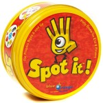
Spot-It-Game-by-Blue-OrangeOur family purchased the original Spot it game a while back and after playing it for a while I started trying to figure out how it worked.  I was fascinated by how there could only be one match no matter what two cards you looked at.

From their website: “There is always one, and only one, matching symbol between any two cards!” Wait, out of 55 cards if you grab any two cards there is only one match between them? How is that possible?

Matching example

Finding out how it works

I went to the internet to find out how it worked. I found several discussions about it that were all above my mental capacities for math. Then I bumped into an article called Spot-it – How’d They Do That by RadiganEngineering that had examples of what the cards would be for different item counts. Well, if I didn’t have to figure things out, I could do something with that.

Making my own version

I thought it would be really cool to make my own Spot It game with my own pictures. So I started digging into making a web version that could accept input and generate the game for me to be printed out. After way too many hours of playing with the code and neglecting my family, I was able to create a Spot it game clone. It allows you to provide your own images or words and cards will be “randomly” generated. I used the structure from RadiganEngineering but randomize the card order and randomize the order of the items within each card.

first-print
The first print on 3×5 cards

Naturally I had to keep adding functionality, demo content, saving the data locally, pass content in via the URL, load demos via URL, drag and drop images, etc. The basic card generation and game I had done in a day, all the other stuff took too many weekends.

I hope this is of benefit to others. I found this blog post about creating a Spot It game with family pictures. It looks like it took a LOT of work to make that happen. Hopefully my site allows similar creations in a fraction of the time.
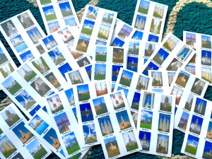
Second print on 3x5 cards, with 6 items per card
Second print on 3×5 cards, with 6 items per card. I have since fixed the cropped text at the bottom.

Technical details

I don’t pretend to think this is perfect. It was hacked together pretty quickly despite it taking so long. I debated between using newer technologies (SASS, ES6, etc) to help myself improve in those areas, but for now I decided to leave it as basic JavaScript so that it is easier for others to understand. Some day I may make it fancier. So for all my techy friends, don’t mock my lack of using the latest and greatest, it was for the greater good 🙂 Some day it will bother me enough to update everything, but for now it is what it is.

It is entirely done client-side via JavaScript. Nothing is sent to the server.  Most of it is custom written, but I did find an amazing drag and drop library called Dropzone that helped out a lot with some cross browser issues.

If you have any feedback, questions, etc you can find me on twitter, post a comment below, or give feedback on the GitHub project.

Categories
HTML, CSS and Javascript

CSS Icon Sprite System

At work, we make a lot of web apps. These are usually very data driven, so lots of tables and forms. To help identify actions on each page we use a number of icons for easy recognition.

We use icons in a few distinct ways. As a stand alone icon with no text and as an icon with text. The icon with text could be on it’s own, or floated left or right with other icons with text as potential actions.

As often happens in teams where many people are touching the CSS, we don’t know what all other team members have added to the site. I would find several declaration of the same icon, sometimes with the same styling but with different names such as “add-property” and then again as “add-agreement”.

So I set out to make a more efficient system for using our icons. I think this may have been around the time I first saw Nicole Sullivans Object Oriented CSS talk so I was inspired to make things a little more… object oriented (reusable chunks not tied to any given structure).

This is what I came up with.

How it works

First, lets make the element we want to act on semantically correct. Use the appropriate element (anchor, span, etc) and insert the appropriate text.

<a href="#d">Delete property</a>

Delete property

To make the site a bit more performant I wanted this system to use CSS sprites. So I combined the most commonly used icons into a diagonal sprite. Adding the class of “sprite” loads the sprite image into the layer. Since we are using a diagonal sprite that is positioned to 0,0 by default, it would show nothing. Or more specifically, the empty white space in the top left corner.

<a href="#d" class="sprite">Delete property</a>

Delete property

Not much of a change.

You then call the class of the icon within the sprite (code near end of article) that you want such as delete, edit, info, etc. This positions the sprite correctly to show the specific icon you want but it is still not spaced correctly.

<a href="#d" class="sprite delete">Delete property</a>

Delete property

Then you can add one of the following classes that define how the icon will be used (spacing). Each must be accompanied by the sprite class or they won’t work. They are as follows:

.icon

This will hide the text and show the icon only. The element will be set to the icon height (usually 16×16). Useful for a delete/edit/etc column in a table. The text is hidden, but still there for accessibility and potentially SEO if public.

<a href="#d" class="sprite delete icon">Delete property</a>

Delete property

.prefix

This will add padding to the left side of the element to make room for the icon and a little space in-between (20px total).

<a href="#d" class="sprite delete prefix">Delete property</a>

Delete property

.right

Floats the element to the right and adds a margin-left to provide spacing between multiple floated elements.

<a href="#d" class="sprite delete prefix right">Delete property</a>

Delete property

.left

Floats the element to the left and adds a margin-right to provide spacing between multiple floated elements.

<a href="#d" class="sprite delete prefix left">Delete property</a>

Hopefully it’s obvious how, by mixing the correct classes, you can create many more options then are specifically defined. You can easily add or change icons without having to go back to the CSS to create new combinations each time. You can just add a new “print” icon and instantly use it with the icon/prefix/etc classes. You don’t need to add print-icon, print-prefix, etc.

Here is the CSS

/* Set up the utility classes */
.sprite { background:url(/files/diagonalsprites/sprite-diagonal.png) no-repeat top left;}
.sprite.icon { height:16px; width:16px; overflow:hidden; display:inline-block; text-indent:100em; cursor:hand; cursor:pointer; }
*+html .sprite.icon { text-indent:0; width:0; padding-left:16px; } /*IE7 sucks*/
.sprite.prefix { padding-left:20px; height:20px; display:inline-block; }
.sprite.right { float:right; margin-left:15px; }
.sprite.left { float:left; margin-right:15px; }
/* Now the individual icons */
.accept { background-position: -234px -0px; }
.add { background-position: -208px -26px; }
.bomb { background-position: -182px -52px; }
.delete { background-position: -156px -78px; }
.feed { background-position: -130px -104px; }
.heart { background-position: -104px -130px; }
.lock { background-position: -78px -156px; }
.pencil { background-position: -52px -182px; }
.star { background-position: -26px -208px; }
.user { background-position: -0px -234px; }

Conclusion

I hope this system, or a derivative of it, can help you in your work. Several on my team have found this to be a great time saver. Once you understand the system and can remember the names of the specific icons, you can easily create many different displays for your icons without ever having to go back to the CSS. I use this almost daily at work and love the simplicity it bring to my pages.

I would love any feedback on how it can be improved and to hear of how you leverage it your own projects.

Categories
HTML, CSS and Javascript

Diagonal CSS Sprites

So you’ve got your sprite created, and it’s working great. 30+ icons in one image… major HTTP connections saved. You have made your little corner of the interwebs a little happier and faster. Steve Souders would be proud.

Until you find that your sprite is used on an element that is tall enough to expose the next image component down in the sprite.  The 50px of spacing between components you thought would be enough… isn’t. 50px isn’t enough so 100px should be right? Better make it 200px to be ultra safe. So you increase the space between all of your components from 50px to 200px which increases the height by 400% and probably increases the filesize a bit too.

The 200px spacing surely is tall enough… right?  RIGHT??!? Surely no content maintainer would ever put more then 200px of content in there after you hand it off. *gulp*

I figured there had to be a better way to make sure this didn’t happen. Horizontally spacing the sprite would solve the too tall issue, but then it has to be spaced out pretty decently as well. Probably even more than the vertical spacing.  What I wanted was the best of both worlds. Horizontal AND vertical spacing.

What do you get when you both horizontally and vertically space something? A diagonal.  I searched around but couldn’t find any mention of a diagonal sprite. I didn’t know if that meant this was a new idea, or a bad one that no one was willing to publish. I’m hoping it’s the former.

Why a Diagonal Sprite?

With the sprite built on a diagonal there are no components below or to the right of the component you are showing. This allows for the element using the sprite to be as wide or as tall as it needs to be with no worry of exposing the next component.

Unfortunately there is a filesize tradeoff. You add a LOT of unused whitespace. For one 30 or so component sprite that I changed from vertically stacked to diagonally stacked, there was only about a 10% increase in size.  For another that had around 60 images, it was a 45% increase. The 10% increase was pretty easy to swallow for the benefit gained. The 45% is a bit harder. So your mileage may vary.

Since you don’t have to put as much spacing between your sprite components (I do 10px vertically and horizontally to allow a little per component manipulation) the sprite dimensions are significantly smaller.  My 60 sprite image with 50px of space between components was 2142px tall. Spacing it out to 200px between components took it to over 8000px. The diagonal sprite using the same 60 components, with 10px padding ends up being around 1500px tall and wide. As far as I can tell this only really matters to the Opera browser. I can’t find information on any other browser having issues with ginormous dimensions, but would love to hear feedback if you know of other issues.

So that you can see this in practice, I created a simple 10 component sprite from a few icons from the famfamfam silk icon set (seen above). You can view an example page that shows the 50px, 200px and diagonally spaced sprites. The filesizes and dimensions ended up being: 50px – 16×610 5,723 bytes, 200px – 16×1960 5,967 bytes, diagonal – 250×250 6,554 bytes.

Resize the page to be fairly narrow to get content to wrap and even the 200px spaced sprite exposes an additional component.

Making the Diagonal Sprite

When making my normal vertically stacked sprites I use the fantastic online tool CSS Sprite Generator.  I noticed that the back end for that was open source and so grabbed a copy.

After significant pain in getting the required components installed on my local machine (post on that coming later), I tweaked their code to output the sprite in a diagonal. At the moment the code is kind of quick and dirty since I wasn’t sure if it was going to work. If there is interest in me making it available, please let me know in the comments below and I’ll try to get it cleaned up and released.

In the end I think this is a pretty decent solution to the problem I ran into. It probably doesn’t work for everyone and the filesize increase is something to consider, but it is an interesting option to have in the back pocket. I would love to hear your thoughts on this solution.