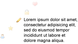
At work, we make a lot of web apps. These are usually very data driven, so lots of tables and forms. To help identify actions on each page we use a number of icons for easy recognition.
We use icons in a few distinct ways. As a stand alone icon with no text and as an icon with text. The icon with text could be on it’s own, or floated left or right with other icons with text as potential actions.
As often happens in teams where many people are touching the CSS, we don’t know what all other team members have added to the site. I would find several declaration of the same icon, sometimes with the same styling but with different names such as “add-property” and then again as “add-agreement”.
So I set out to make a more efficient system for using our icons. I think this may have been around the time I first saw Nicole Sullivans Object Oriented CSS talk so I was inspired to make things a little more… object oriented (reusable chunks not tied to any given structure).
This is what I came up with.
How it works
First, lets make the element we want to act on semantically correct. Use the appropriate element (anchor, span, etc) and insert the appropriate text.
<a href="#d">Delete property</a>
To make the site a bit more performant I wanted this system to use CSS sprites. So I combined the most commonly used icons into a diagonal sprite. Adding the class of “sprite” loads the sprite image into the layer. Since we are using a diagonal sprite that is positioned to 0,0 by default, it would show nothing. Or more specifically, the empty white space in the top left corner.
<a href="#d" class="sprite">Delete property</a>
Not much of a change.
You then call the class of the icon within the sprite (code near end of article) that you want such as delete, edit, info, etc. This positions the sprite correctly to show the specific icon you want but it is still not spaced correctly.
<a href="#d" class="sprite delete">Delete property</a>
Then you can add one of the following classes that define how the icon will be used (spacing). Each must be accompanied by the sprite class or they won’t work. They are as follows:
.icon
This will hide the text and show the icon only. The element will be set to the icon height (usually 16×16). Useful for a delete/edit/etc column in a table. The text is hidden, but still there for accessibility and potentially SEO if public.
<a href="#d" class="sprite delete icon">Delete property</a>
.prefix
This will add padding to the left side of the element to make room for the icon and a little space in-between (20px total).
<a href="#d" class="sprite delete prefix">Delete property</a>
.right
Floats the element to the right and adds a margin-left to provide spacing between multiple floated elements.
<a href="#d" class="sprite delete prefix right">Delete property</a>
.left
Floats the element to the left and adds a margin-right to provide spacing between multiple floated elements.
<a href="#d" class="sprite delete prefix left">Delete property</a>
Hopefully it’s obvious how, by mixing the correct classes, you can create many more options then are specifically defined. You can easily add or change icons without having to go back to the CSS to create new combinations each time. You can just add a new “print” icon and instantly use it with the icon/prefix/etc classes. You don’t need to add print-icon, print-prefix, etc.
Here is the CSS
/* Set up the utility classes */

.sprite	{ background:url(/files/diagonalsprites/sprite-diagonal.png) no-repeat top left;}

.sprite.icon	{ height:16px; width:16px; overflow:hidden; display:inline-block; text-indent:100em; cursor:hand; cursor:pointer; }

*+html .sprite.icon	{ text-indent:0; width:0; padding-left:16px; } /*IE7 sucks*/

.sprite.prefix	{ padding-left:20px; height:20px; display:inline-block; }

.sprite.right	{ float:right; margin-left:15px; }

.sprite.left	{ float:left; margin-right:15px; }

/* Now the individual icons */

.accept	{ background-position: -234px -0px;  }

.add	{ background-position: -208px -26px;  }

.bomb	{ background-position: -182px -52px;  }

.delete	{ background-position: -156px -78px;  }

.feed	{ background-position: -130px -104px;  }

.heart	{ background-position: -104px -130px;  }

.lock	{ background-position: -78px -156px;  }

.pencil	{ background-position: -52px -182px;  }

.star	{ background-position: -26px -208px;  }

.user	{ background-position: -0px -234px;  }
Conclusion
I hope this system, or a derivative of it, can help you in your work. Several on my team have found this to be a great time saver. Once you understand the system and can remember the names of the specific icons, you can easily create many different displays for your icons without ever having to go back to the CSS. I use this almost daily at work and love the simplicity it bring to my pages.
I would love any feedback on how it can be improved and to hear of how you leverage it your own projects.
